Claude Opus 4.7's house style is already editorial — the work is restraint, not extraction
Which AI design skills actually produce high-taste editorial frontend output, and why the answer is mostly already inside Claude.

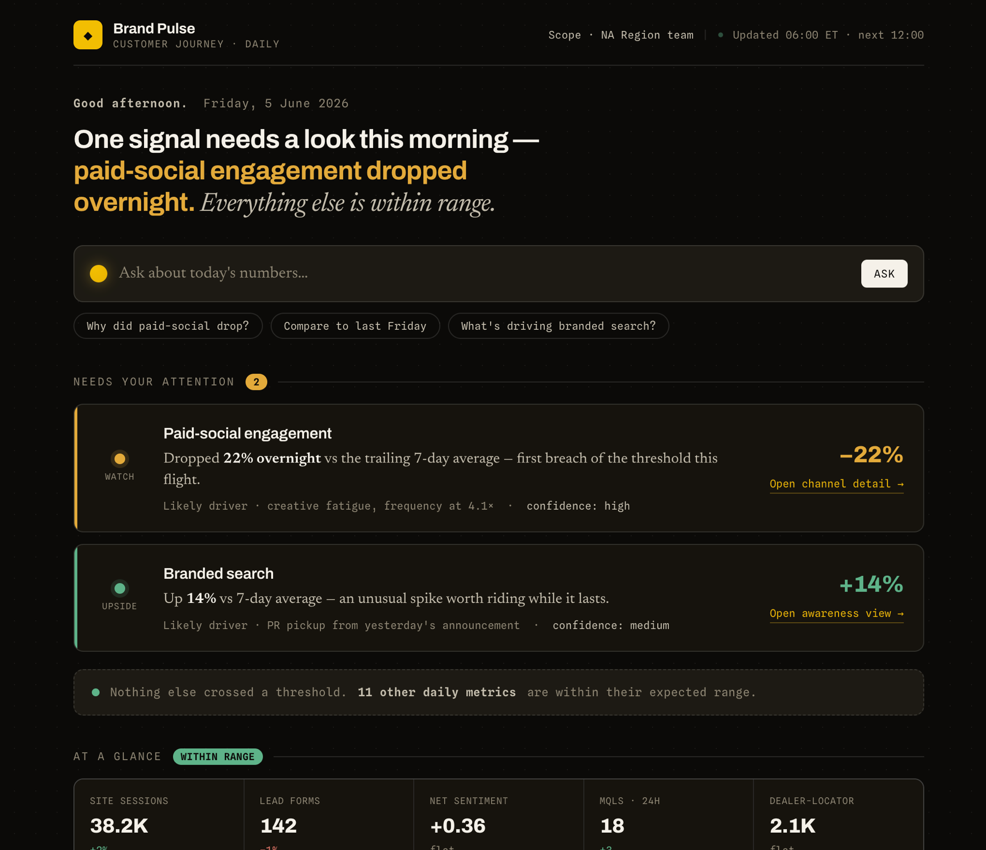
Anthropic’s frontend-design skill paired with Paul Bakaus’s impeccable in brand mode is the strongest stack for an editorial writer’s notebook site. The critical insight: Claude Opus 4.7’s default house style — warm cream (~#F4F1EA) backgrounds, serif display type (Georgia, Fraunces, Playfair), italic word-accents, terracotta accent — is already aimed at editorial, hospitality, and portfolio work. For a plainspoken writer’s notebook, you mostly need to restrain the model, not push it harder.
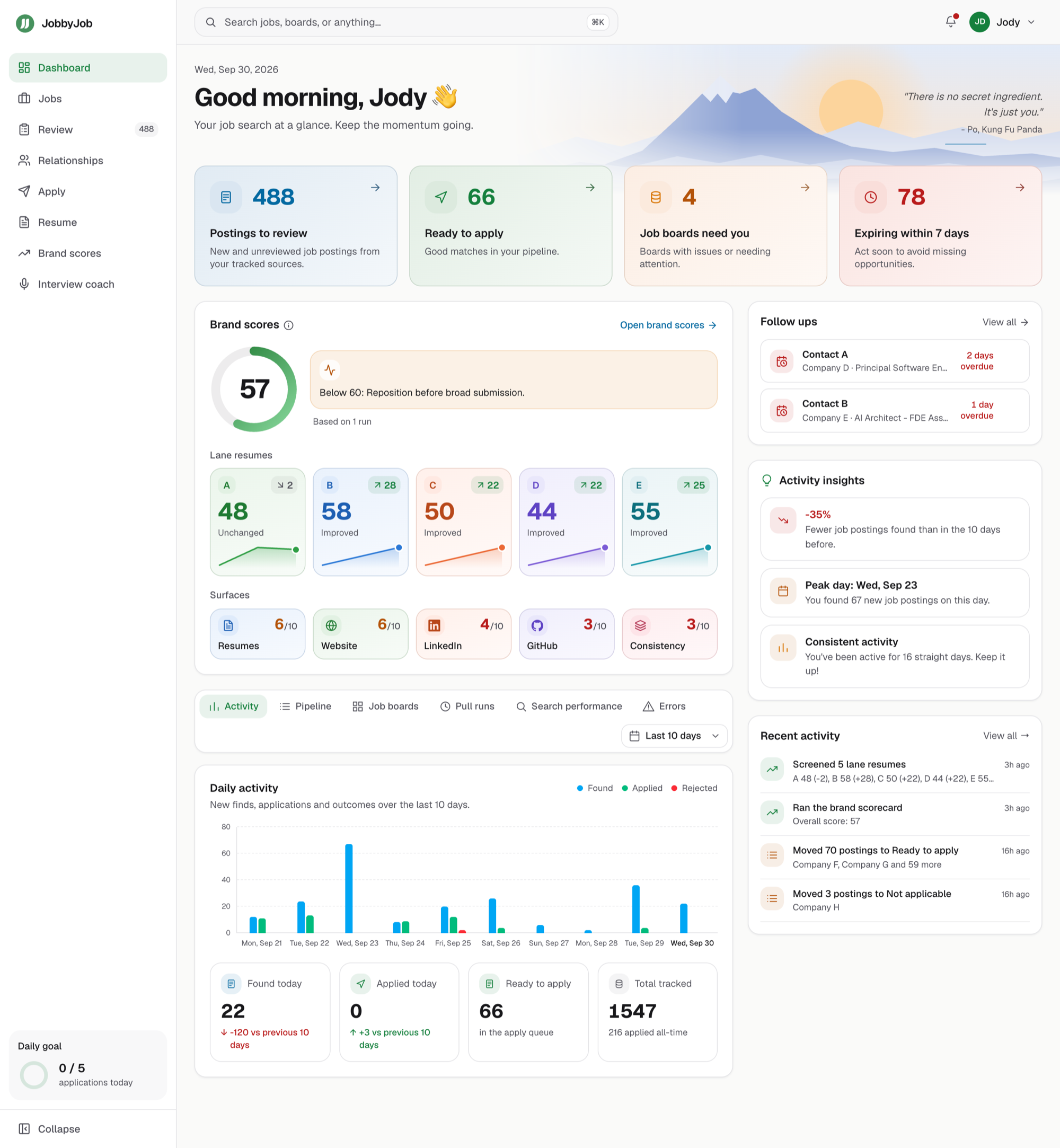
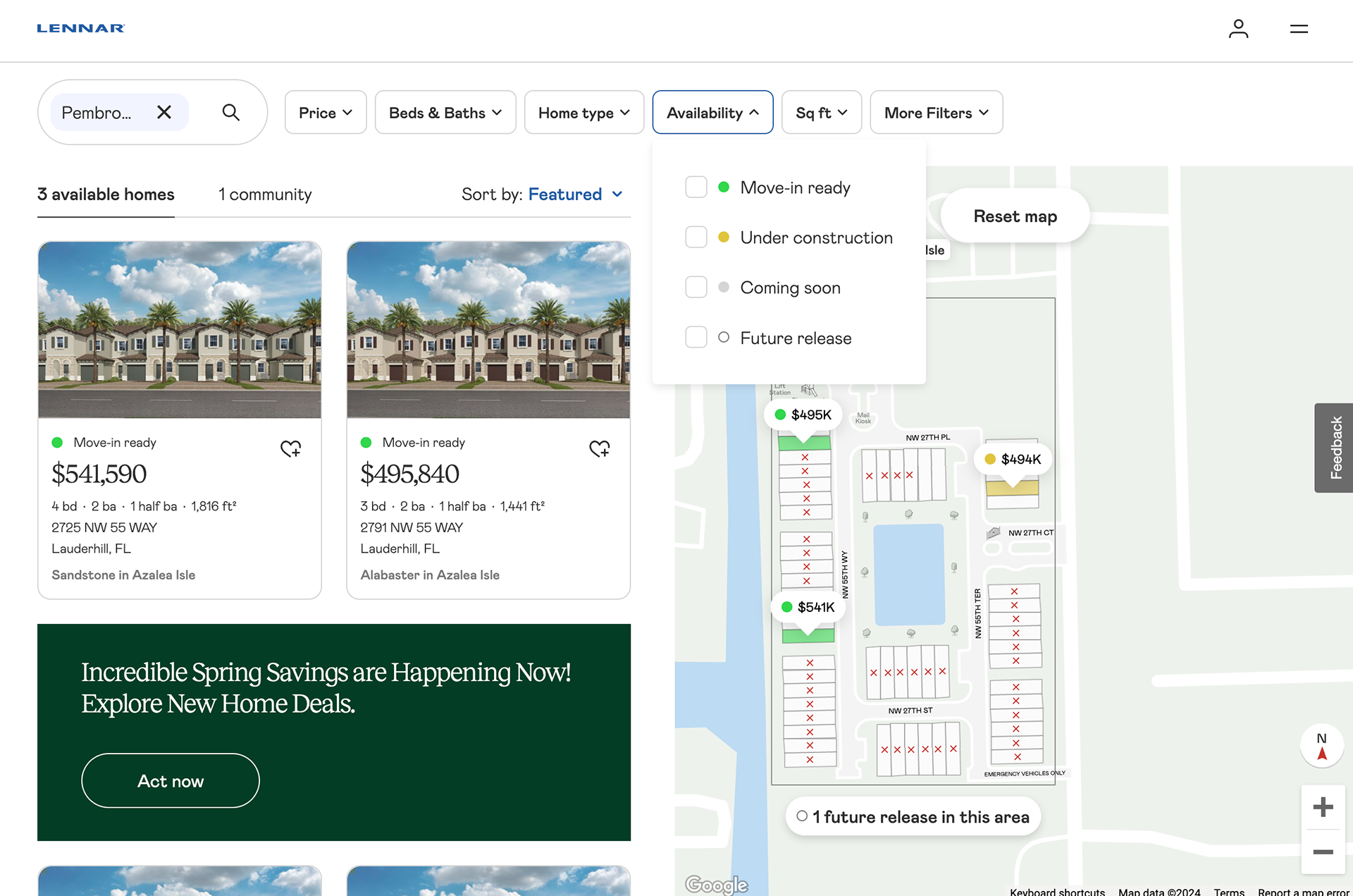
UI/UX Pro Max and the v0/Lovable/Bolt category are wrong-shape for this project. Database-driven recommendations converge on the median; full-stack builders default to shadcn/Tailwind SaaS aesthetics. Neither gets you to “unhurried editorial” without fighting defaults hard. Below is the landscape ranked by fit for an Astro 5 editorial brief.
The tools
1. Anthropic frontend-design (official, built into Claude)
The floor everyone else builds from. ~277,000 installs, corroborated by five independent sources. Before writing any code it forces the model through four dimensions — purpose, tone, constraints, differentiation — and explicitly lists “editorial/magazine” as one of 11 example tones. Bans Inter, Roboto, Arial, system fonts, and Space Grotesk as overused by AI.
Anthropic’s own prompt-engineering docs state that Opus 4.7 “has stronger design instincts than Opus 4.6, with a consistent default house style: warm cream/off-white backgrounds (~#F4F1EA), serif display type (Georgia, Fraunces, Playfair), italic word-accents, and a terracotta/amber accent. This reads well for editorial, hospitality, and portfolio briefs.” The same docs warn that “generic instructions (‘don’t use cream,’ ‘make it clean and minimal’) tend to shift the model to a different fixed palette rather than producing variety” — meaning blunt overrides don’t work. You need to specify an alternative direction, not negate the default.
The skill’s bias toward bold aesthetics (“pick an extreme”) is the one thing to override explicitly for an editorial brief. Add “restrained, unhurried, plainspoken” to your CLAUDE.md and the skill respects it.
2. impeccable by Paul Bakaus (impeccable.style)
The senior-designer layer on top of Anthropic’s floor. Free, Apache 2.0, ~29.5k GitHub stars. Paul Bakaus created jQuery UI, ran Chrome DevTools as product lead at Google, launched AMP/Web Stories, was Google’s first Head of Creator Relations. The credential matters: this is not a hobbyist prompt pack.
What it adds beyond the floor: 23 sub-commands that convert vague instructions into specific verbs. /quieter is the explicit opposite of bolder — where an editorial brief lives. /typeset is a typography-only pass, the single highest-leverage intervention for a text-first site. /distill removes ornament. /shape writes a design brief without touching code, useful for establishing direction before any implementation. The brand vs product mode split is how seniors actually think: a marketing site and an internal admin tool need opposite defaults, and most skills pretend they don’t.
The v3.0.7 changelog explicitly added “oversized italic-serif display heroes” (Fraunces, Recoleta, Newsreader, Playfair, Cormorant, Tiempos) to its deterministic anti-pattern detector, calling it “a structural fingerprint of late-2025 and early-2026 AI-generated marketing pages.” Running npx impeccable detect before shipping catches the patterns that make Claude output look like Claude output.
Two caveats worth keeping. Emelia’s review: “Vocabulary is not taste. Knowing the term ‘tinted neutrals’ does not mean knowing when to use them.” And the top HN comment on impeccable.style itself: “It’s chaotic, the text is often hard to read and there is a ton of fluff, both in terms of visuals and copy.” The tool’s own homepage is brand-mode maximalism. For an editorial brief, you want the inverse of what the marketing site demonstrates.
3. UI/UX Pro Max (NextLevelBuilder, uupm.cc)
v2.5.0 ships 67 UI styles, 161 palettes, 57 font pairings, backed by a searchable local CSV database queried via Python CLI. The Premium tier with unlimited API access is currently paused as of May 2026, with prorated refunds issued to existing subscribers.
Snyk calls it “the most comprehensive design intelligence skill in the current ecosystem” — accurate measured by database size, not by taste. Database-driven recommendations produce competent, industry-appropriate UI by retrieving known-good combinations; they tend to converge on the median, which is the failure mode an editorial brief most needs to avoid. The Style Gallery on uupm.cc skews toward B2B SaaS dashboards. Wrong tool for this project.
4. Lazyweb (lazyweb.com)
Launched May 2, 2026 by Ali Abouelatta (formerly PM at Duolingo). Free MCP + 6 skills giving Claude Code, Codex, and Cursor access to 257k+ real app screens. The distinguishing move: it teaches by example rather than rules. The cross-pollination skill deliberately searches outside your product category — for an editorial brief that means pulling references from small museums, fine-art publishers, and magazine archives rather than the SaaS app corpus.
Worth installing when you need a real-world reference rather than an abstract description. Not a substitute for the frontend-design + impeccable stack; a complement when that stack runs out of ideas.
5. v0 / Lovable / Bolt / Subframe / Magic Patterns
Product-building surfaces, not taste injectors. v0 has the best raw code quality; Lovable scored 8/10 on design vs Bolt’s 5/10 in DesignRevision’s head-to-head (“Lovable prioritizes aesthetics while Bolt prioritizes speed”). All default to shadcn/Tailwind SaaS aesthetics; none will produce an editorial writer’s notebook without significant resistance. Reach for v0 at most as a component generator for a specific one-off element — not as a site tool.
What to do, in sequence
This week. Confirm Claude Opus 4.7 + frontend-design is active. Write a CLAUDE.md at the Astro project root with three parts: (1) Astro 5 architecture conventions — Content Collections via Content Layer API, MDX, Astro over React for static surfaces, client:visible over client:load; (2) three pro-references (Craig Mod, Robin Sloan, NYRB); (3) three anti-references (“no magazine-cover cliché, no oversized italic-serif hero, no terracotta, no Fraunces”). Override the skill’s “pick an extreme” instruction explicitly: “Restrained editorial. Unhurried. Plainspoken. Closer to a 1970s paperback than a 2026 SaaS landing page. No drama.”
Next week. Install impeccable (npx skills add pbakaus/impeccable), run /impeccable teach to capture PRODUCT.md and DESIGN.md, set register: brand. The commands with the highest leverage for this brief: /typeset (typography pass first, before anything else), /quieter (the editorial brief lives here, not at /bolder), /distill (remove ornament after the first draft). Run npx impeccable detect before shipping. Use /critique as a second opinion after any handcrafted section.
When you hit a wall. Install Lazyweb’s MCP and use /lazyweb-design-brainstorm to pull from outside the web-app corpus. Don’t install UI/UX Pro Max for this project. Don’t use v0/Lovable/Bolt as primary tools.
Signals that should change these recommendations
If Opus 4.7’s house style starts feeling generic within the first few iterations — the moment you notice “I’ve seen this cream-and-terracotta combo on five other Claude-built sites” — kill the default by specifying an off-axis palette in CLAUDE.md. Graphite + ivory, ink + bone, or a single muted accent that is not terracotta.
If /impeccable typeset keeps reaching for Fraunces/Newsreader/Playfair, that is the italic-serif AI fingerprint the v3.0.7 detector now explicitly catches. Pin to a specific text face — Tiempos Text, Söhne Mono for code, or an H&Co face if budget allows — and remove the typographic choice from the model’s hands entirely.
If you are still writing more CSS than prose after three weeks, you have outgrown “AI does design.” Handcraft the type system and component primitives in Astro yourself, then use Claude only to generate body content and one-off interactive elements within your handwritten shell. The production case studies in this space all eventually reached this point.
What’s missing from the landscape
No prompt pack from Rauno Freiberg, the Linear design team, or the Vercel design-engineering orbit (Emil Kowalski, etc.) exists publicly as of this writing. That taste lives in code on people’s personal sites, not in installable skills. If you want it in Claude, you write the taste skill yourself — a project-local SKILL.md or CLAUDE.md section that codifies your anti-patterns, your banned fonts, your preferred references. That is increasingly the pattern among senior designers in this space, and probably the most reliable approach for someone who already has the taste but needs the model to execute it reliably.